The path to uncovering meaningful insights often starts with a single step: looking at the data before asking questions. This journey through the Ames Housing dataset is more than an exploration; it’s a narrative about the hidden stories within numbers, waiting to be told. Through a “Data First Approach,” we invite you to dive deep into the process of data-driven storytelling, where every visualization, every statistical test, and every hypothesis forms a part of a larger narrative. This blog post is designed to guide you through a step-by-step process of understanding and presenting data, from the initial broad view of the dataset to the focused lens of hypothesis testing, unraveling the intricate tales woven into the Ames Housing Market.
Unfolding Data Stories: From First Glance to In-Depth Analysis
Photo by Emily Morter. Some rights reserved.
Overview
This post is divided into three parts; they are:
- The Data First Approach
- Anchored in Data, Revealed Through Visuals
- From Patterns to Proof: Hypothesis Testing in the Ames Housing Market
The Data First Approach
What comes first, the question or the data?
Starting our data science journey often involves a counterintuitive first step: beginning with the data itself, before posing any specific questions. This perspective is at the heart of the “Data First Approach,” a philosophy that champions the power of discovery by allowing the data to lead the way. Advocating for an open-minded exploration, this approach turns the dataset at hand—such as the detailed and rich Ames Housing dataset—into a guiding light, revealing stories, secrets, and the potential for insightful analysis. This philosophy urges us to set aside our preconceived notions, enabling the data’s inherent trends, patterns, and insights to surface naturally.
A concise three-step guide to embracing this approach includes:
- Sizing Up The Data: The initial step, emphasizing our “Data First Approach,” involves understanding the size and shape of your data, as highlighted in Revealing the Invisible. This stage is crucial for grasping the dataset’s scope and addressing any missing values, setting the groundwork for comprehensive analysis.
- Understanding The Spectrum of Data Types: Delving deeper into our dataset, we explore the variety of data types it contains, a crucial step for informing our choice of visuals and framing our analytical questions. This exploration, akin to navigating through Exploring Dictionaries, is vital for tailoring our analysis and visualization strategies to the data’s inherent characteristics, ensuring our methods are both relevant and effective.
- Descriptive Statistics: Outlined in Decoding Data, this step provides tools for quantitatively summarizing and understanding the dataset, preparing us for deeper analysis and interpretation.
Integrating these steps into our preliminary exploration underscores the “Data First Approach,” systematically unveiling the stories embedded within the Ames Housing dataset. Each step acts as a cornerstone in revealing a fuller narrative. By allowing the data to speak first, we unlock the most compelling stories hidden within the numbers.
Kick-start your project with my book The Beginner’s Guide to Data Science. It provides self-study tutorials with working code.
Anchored in Data, Revealed Through Visuals
Following our “Data First Approach,” where we prioritize a thorough understanding of the dataset and its variables, we naturally progress to the next crucial step: visualization. This stage is where our initial engagement with the data informs the selection of the most appropriate visual tools to illuminate the insights we’ve uncovered. Visualization is not just about making data look appealing; it’s an integral part of the storytelling process, enabling us to “Show, Don’t Tell” the stories hidden within the data. The art lies in choosing the right type of visualization that resonates with the data’s narrative, a decision deeply rooted in our initial exploration. Here are several key visualizations and their optimal use cases:
- Histograms: Ideal for showcasing the distribution of a single numerical variable. Histograms help identify skewness, peaks, and the spread of the data, making them perfect for analyzing variables like income levels or ages within a population.
- Bar Charts: Effective for comparing quantities across different categories. Use bar charts to highlight differences between groups, such as sales figures across different regions or customer counts by product category.
- Line Charts: Best suited for displaying data trends over time. Line charts are the go-to choice for visualizing stock price changes, temperature fluctuations over a year, or sales growth across quarters.
- Scatter Plots: Excellent for exploring relationships between two numerical variables. Scatter plots can help identify correlations, such as the relationship between advertising spend and sales revenue, or height and weight correlations.
- Box Plots (Box-and-Whisker Plots): Useful for summarizing the distribution of a dataset and comparing distributions between groups. Box plots provide insights into the median, quartiles, and potential outliers within data, making them valuable for statistical analyses like comparing test scores across different classrooms.
- Heat Maps: Ideal for visualizing complex data matrices, showing patterns of similarity or variation. Heat maps are effective in areas like displaying website traffic sources across different times of the day or understanding geographical data distributions.
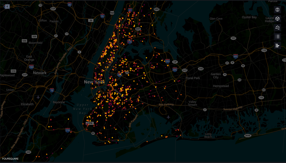
- Geospatial Maps: Ideal for showcasing data with a geographical component, allowing for a visual representation of patterns and trends across different regions. Geospatial maps are perfect for visualizing population density, sales distribution by location, or any data that has a spatial element. They help in identifying regional trends, making them invaluable for analyses that require a geographical context, such as market penetration in different cities or climate change effects in various parts of the world.
- Stacked Bar Charts: Great for displaying part-to-whole relationships and comparisons across categories, with each bar segment representing a sub-category’s value. Use stacked bar charts to illustrate sales data divided by product type over multiple periods.
- Area Charts: Similar to line charts but filled beneath the line, area charts are useful for emphasizing the magnitude of change over time. They work well for visualizing cumulative totals, such as website traffic sources or population growth.
- Pair Plots: Ideal for exploring correlations and distributions among multiple variables simultaneously. Pair plots, or scatterplot matrices, provide a comprehensive view of how every variable in a dataset relates to each other, highlighting potential relationships and trends that merit further investigation. They are particularly useful in the early stages of analysis to quickly assess potential variables of interest.
Visualization is an iterative process. Initial visuals often lead to new questions, prompting further analysis and refined visuals. This cycle enhances our understanding, gradually revealing the fuller narrative woven into our data. To delve deeper into the iterative visualization process using the Ames Housing dataset, let’s explore potential questions and the types of visuals that could help answer them. Here are some questions, along with the suggested types of visuals:
- What patterns can be observed in the sale prices across different months and seasons?
- Visual: Line Charts or Bar Charts to analyze seasonal trends in sale prices.
- How does the lot size compare to the sale price across different zoning classifications?
- Visual: Scatter Plots with different colors for each zoning classification to explore the relationship between lot size and sale price.
- What is the effect of having a pool on the property’s sale price?
- Visual: Box Plots comparing the sale prices of homes with and without pools.
- How do year built and year remodeled affect the property’s overall condition and sale price?
- Visual: Pair Plots to simultaneously explore the relationships between year built, year remodeled, overall condition, and sale price.
- Is there a correlation between the proximity to various amenities (parks, schools, etc.) and sale prices?
- Visual: Geospatial Maps with overlays indicating amenities proximity and Scatter Plots to correlate these distances with sale prices.
These questions encourage exploring the dataset from various angles, leading to a richer understanding through iterative visualization. Each visualization not only answers the initial question but may also spark further inquiry, demonstrating the dynamic process of data exploration and storytelling.
From Patterns to Proof: Hypothesis Testing in the Ames Housing Market
After immersing ourselves in the “Data First Approach” and harnessing the power of visuals to uncover hidden patterns and relationships within the Ames Housing dataset, our journey takes us to the crucial phase of hypothesis formation and testing. This iterative process of questioning, exploring, and deducing represents the essence of data-driven storytelling, transforming observations into actionable insights.
We are now ready to ask deeper questions, inspired by the patterns and anomalies our visuals have uncovered. Here are few possible directions one can take that have not yet been demonstrated in our previous posts:
- Does the sale price depend on the neighborhood?
- Statistical Test: One-way ANOVA to compare sale prices across multiple neighborhoods, assuming equal variances; otherwise, Kruskal-Wallis test.
- Is there a significant difference in sale prices between the different types of dwellings (e.g., 1-story vs. 2-story homes)?
- Statistical Test: ANOVA for multiple groups, or t-test for comparing two specific dwelling types.
- Are there significant differences in sale prices among houses with different exterior materials?
- Statistical Test: Chi-square test for independence after categorizing sale prices into bands (low, medium, high) and comparing against types of exterior materials.
- Is the sale price influenced by the season in which the house is sold?
- Statistical Test: Kruskal-Wallis test or ANOVA, depending on the distribution, to compare median sale prices across different seasons, identifying if certain times of the year yield higher sale prices.
- Does having a finished vs. unfinished basement significantly impact the sale price?
- Statistical Test: T-test or Mann-Whitney U test (based on the data distribution) to compare the sale prices between homes with finished basements versus those with unfinished basements.
The transition from visualization to hypothesis testing is not merely analytical; it’s a creative process that involves synthesizing data insights into compelling narratives. Each hypothesis tested sheds light on the dynamics at play within the housing market, contributing chapters to the broader story of the Ames dataset. As we validate or refute our hypotheses, we’re not just gathering evidence; we’re constructing a story grounded in data. This narrative might reveal how the Ames housing market pulsates with the rhythms of the seasons, or how modernity commands a premium, reflecting contemporary buyers’ preferences.
Further Reading
Resources
Summary
By marrying the “Data First Approach” with the iterative exploration of visuals and the rigor of hypothesis testing, we unlock a deeper understanding of our data. This approach not only enhances our comprehension but also equips us with the tools to share our findings compellingly and convincingly, turning data exploration into an engaging narrative that resonates with audiences. In embracing this threefold path—anchored in data, revealed through visuals, and narrated through hypotheses—we craft stories that not only inform but inspire, showcasing the transformative power of data-driven storytelling.
Specifically, you learned:
- The importance of the data-first mindset.
- The role of iterative discovery in building visuals.
- The creative process surrounding hypothesis testing.
Do you have any questions? Please ask your questions in the comments below, and I will do my best to answer.


